Introduction
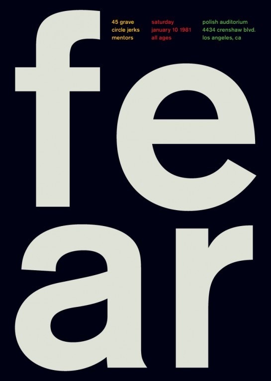
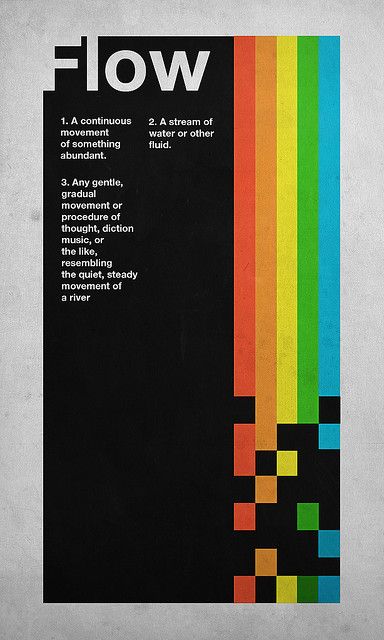
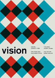
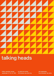
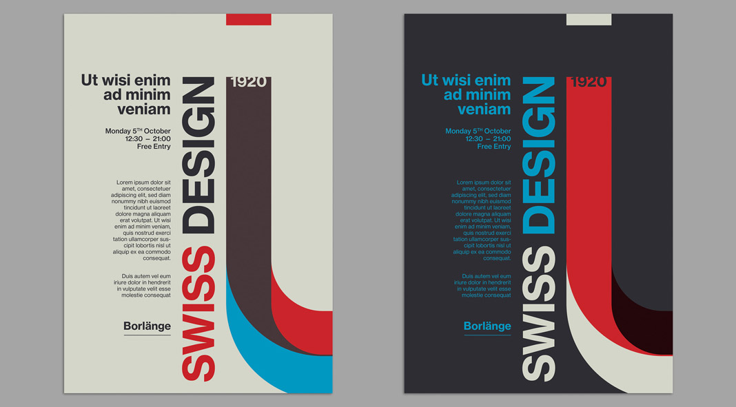
The International Typographic Style, also known as the Swiss Style, is a graphic design style that emerged in Russia, the Netherlands, and Germany in the 1920s and was further developed by designers in Switzerland during the 1950s. The International Typographic Style has had profound influence on graphic design as a part of the modernist movement, impacting many design-related fields including architecture and art. It emphasizes cleanness, readability, and objectivity. Hallmarks of the style are asymmetric layouts, use of a grid, sans-serif typefaces like Akzidenz Grotesk, and flush left, ragged right text. The style is also associated with a preference for photography in place of illustrations or drawings.
Many of the early International Typographic Style works featured typography as a primary design element in addition to its use in text, and it is for this that the style is named. The influences of this graphic movement can still be seen in design strategy and theory to this day.
Helvetica
Helvetica (originally Neue Haas Grotesk) is a widely used sans-serif typeface developed in 1957 by Swiss typeface designer Max Miedinger and Eduard Hoffmann.
Helvetica is a neo-grotesque design, one influenced by the famous 19th century (1890s) typeface Akzidenz-Grotesk and other German and Swiss designs.[2] Its use became a hallmark of the International Typographic Style that emerged from the work of Swiss designers in the 1950s and '60s, becoming one of the most popular typefaces of the mid-20th century.[3] Over the years, a wide range of variants have been released in different weights, widths, and sizes, as well as matching designs for a range of non-Latin alphabets. Notable features of Helvetica as originally designed include a high x-height, the termination of strokes on horizontal or vertical lines and an unusually tight spacing between letters, which combine to give it a dense, solid appearance.
Developed by the Haas'sche Schriftgiesserei (Haas Type Foundry) of Münchenstein (Basel), Switzerland, its release was planned to match a trend: a resurgence of interest in turn-of-the-century "grotesque" sans-serifs among European graphic designers, that also saw the release of Univers by Adrian Frutiger the same year. Hoffmann was the president of the Haas Type Foundry, while Miedinger was a freelance graphic designer who had formerly worked as a Haas salesman and designer.
Miedinger and Hoffmann set out to create a neutral typeface that had great clarity, had no intrinsic meaning in its form, and could be used on a wide variety of signage. Originally named Neue Haas Grotesk (New Haas Grotesque), it was rapidly licensed by Linotype and renamed Helvetica in 1960, which in Latin means "Swiss" (from Helvetia), capitalising on Switzerland's reputation as a centre of ultra-modern graphic design.[8] A feature-length film directed by Gary Hustwit was released in 2007 to coincide with the 50th anniversary of the typeface's introduction in 1957.